1
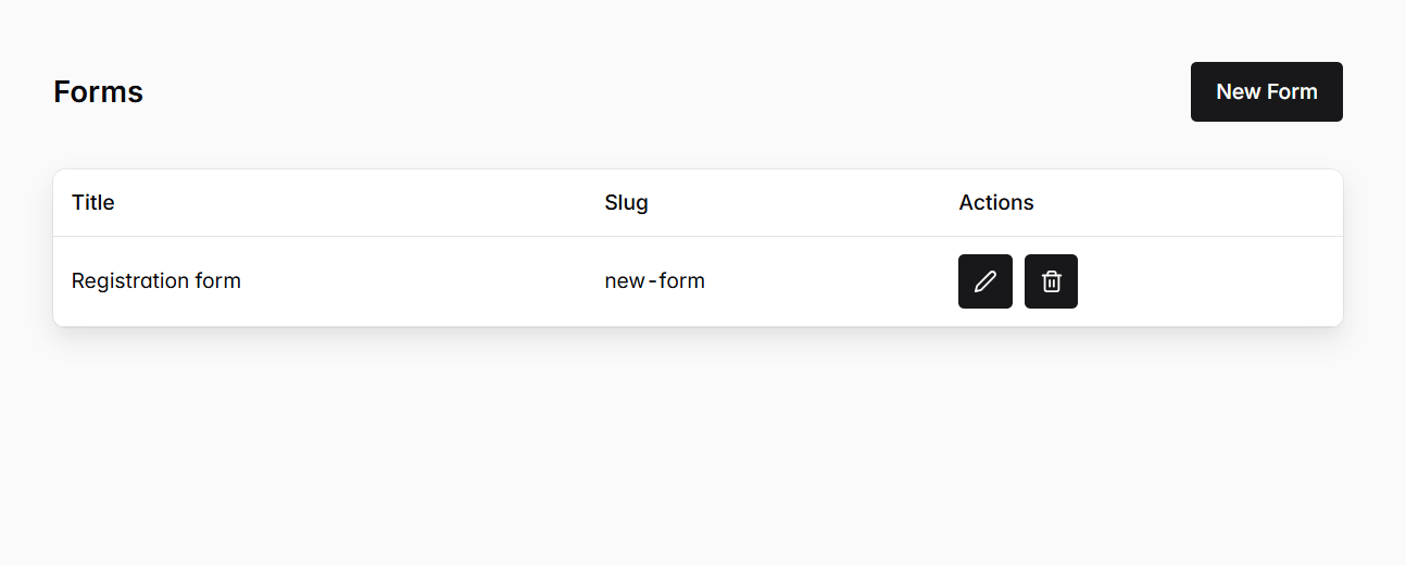
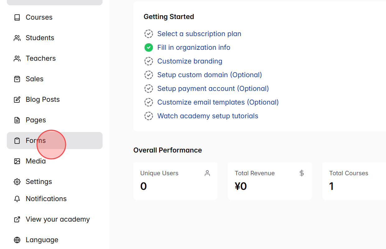
From the Dashboard, click Forms in the side menu. This will take you to the Forms section where all your forms are listed.
2
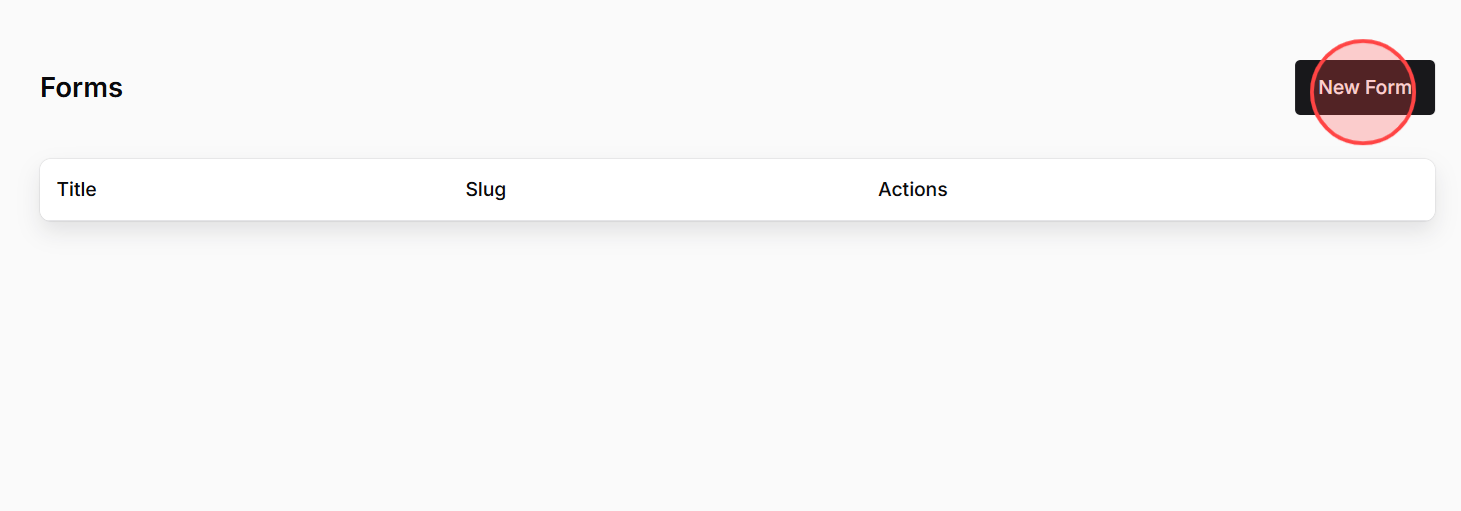
On the Forms page, click New Form to start creating a new one.
3
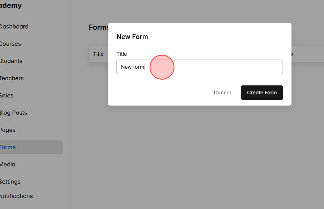
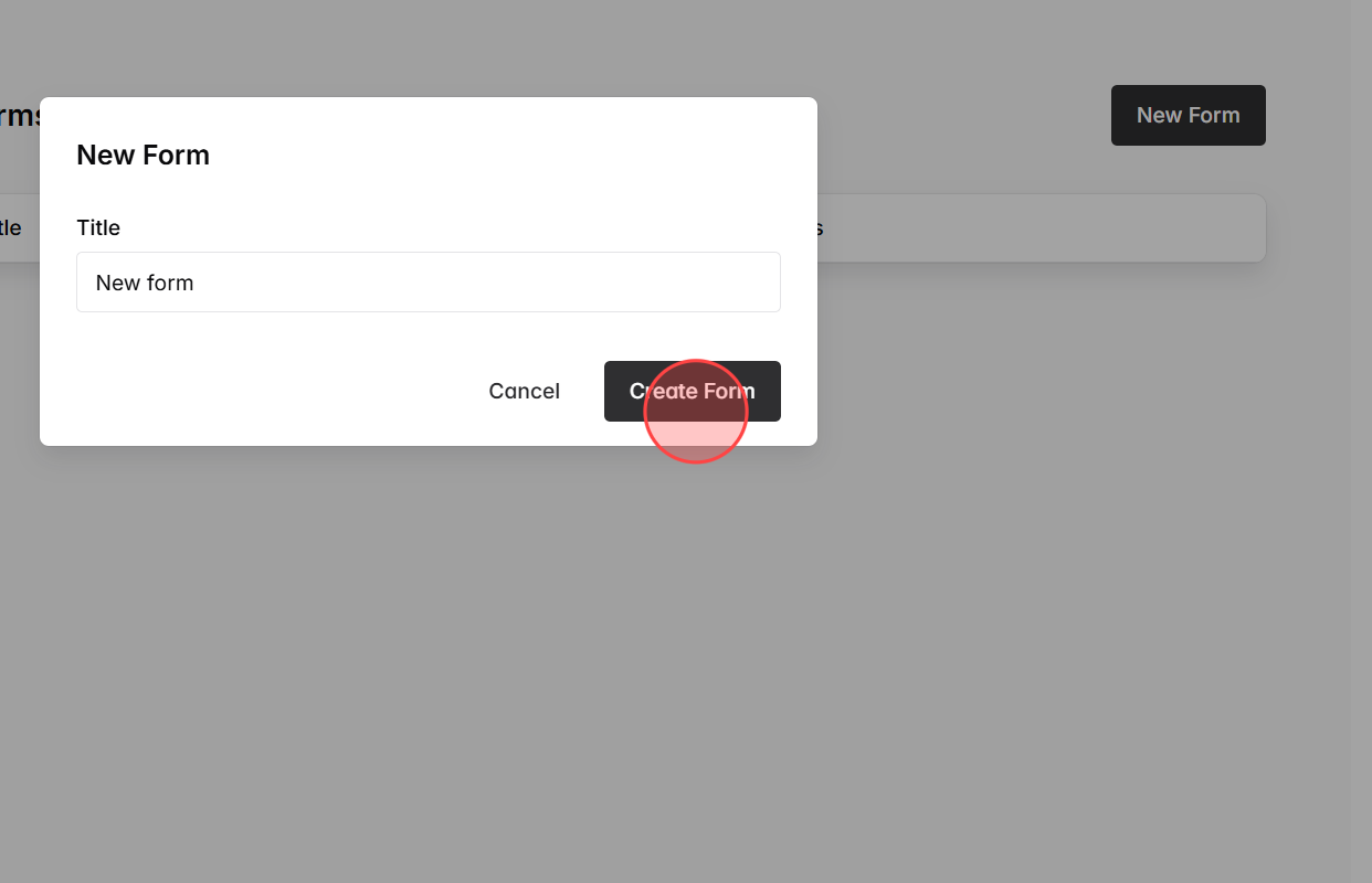
In the Title field, type a name for your form. This title is mainly for your internal management.
4
Click Create Form to confirm and generate the form.
5
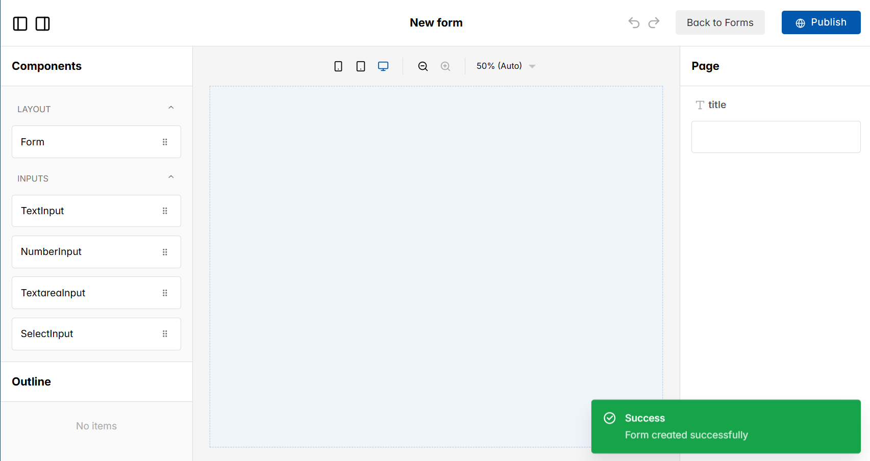
The system will automatically navigate you to the Edit Form page, which is the main workspace where you can design and customize your form.
6
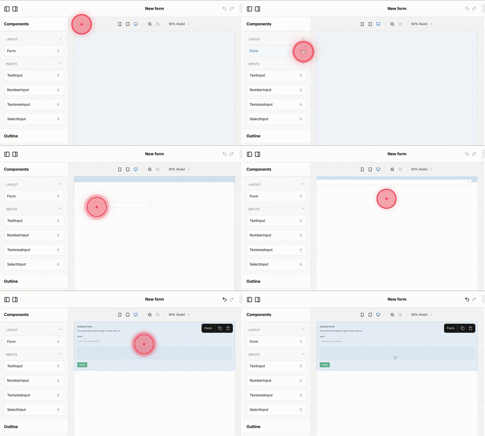
In the left-hand Components panel, find the Form Layout element. Drag and drop it into the editor area.
7
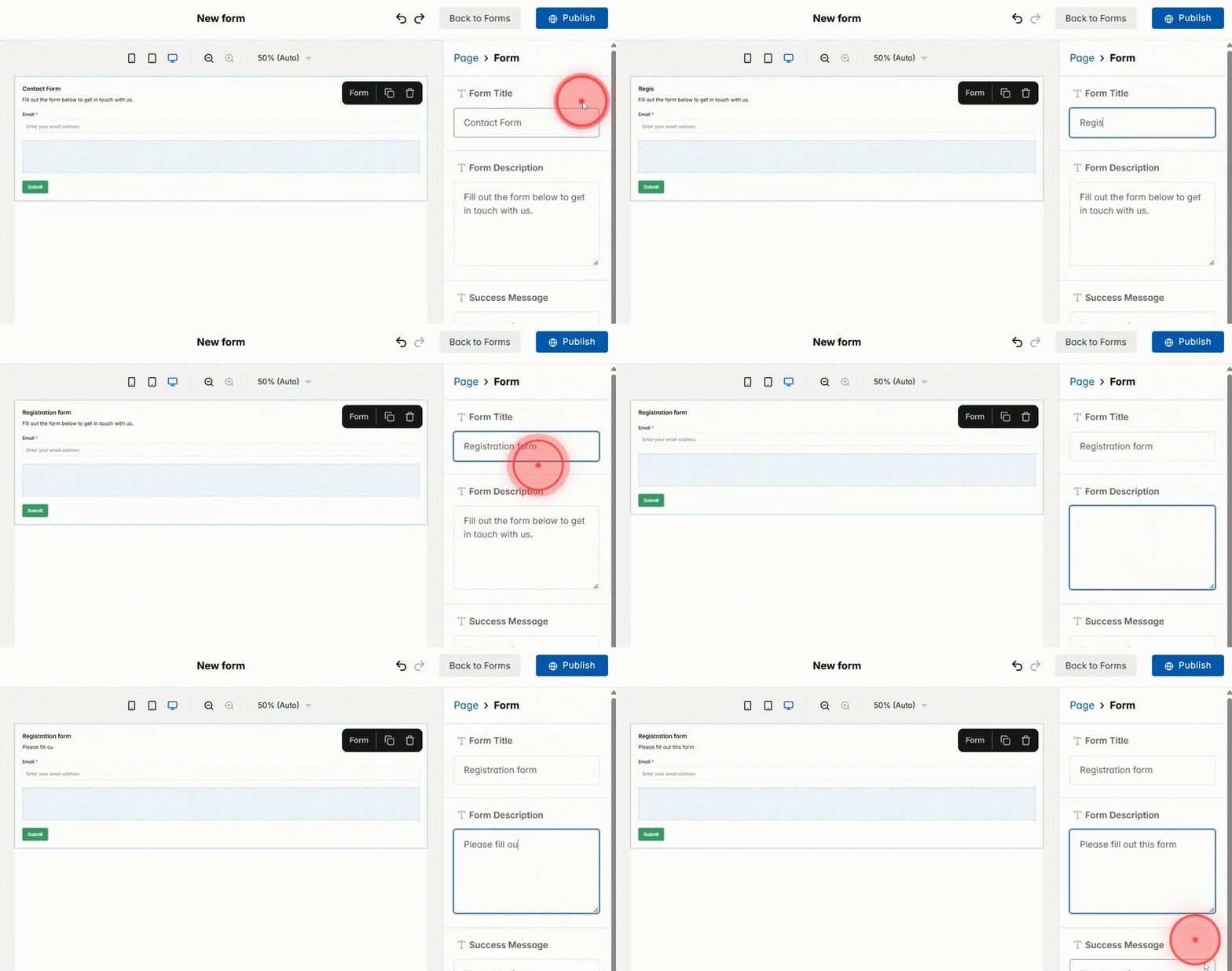
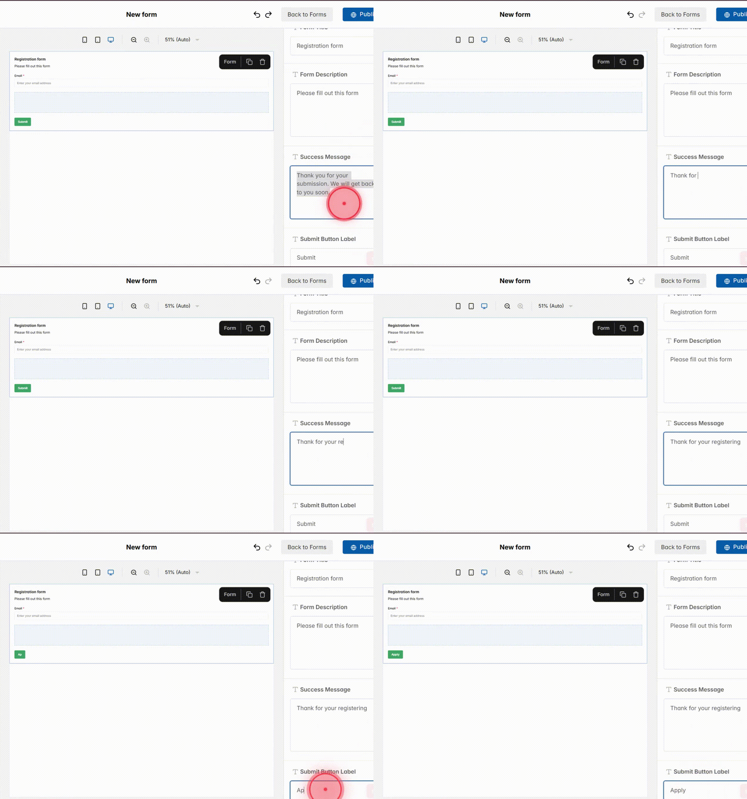
Fill in the form layout settings:
– Form Title → The name shown at the top of the form. It should be clear and user-facing.
Example: Registration Form.
– Form Description → A short piece of text under the title that tells users what the form is for.
Example: Please fill out this form.
8
Fill in the submission settings:
– Success Message → Short confirmation text that appears after submission
Example: Thank for your registering
– Submit Button Label → Text on the main button, customize it to match the form’s purpose
Example: Apply
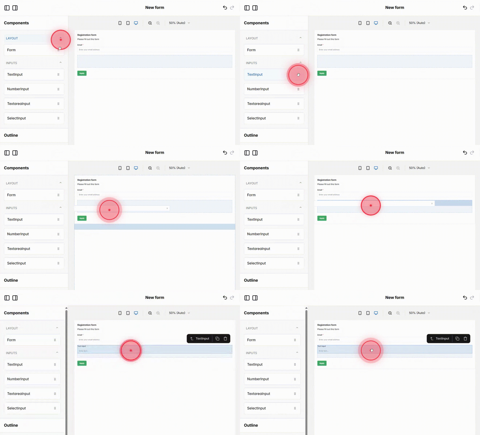
9
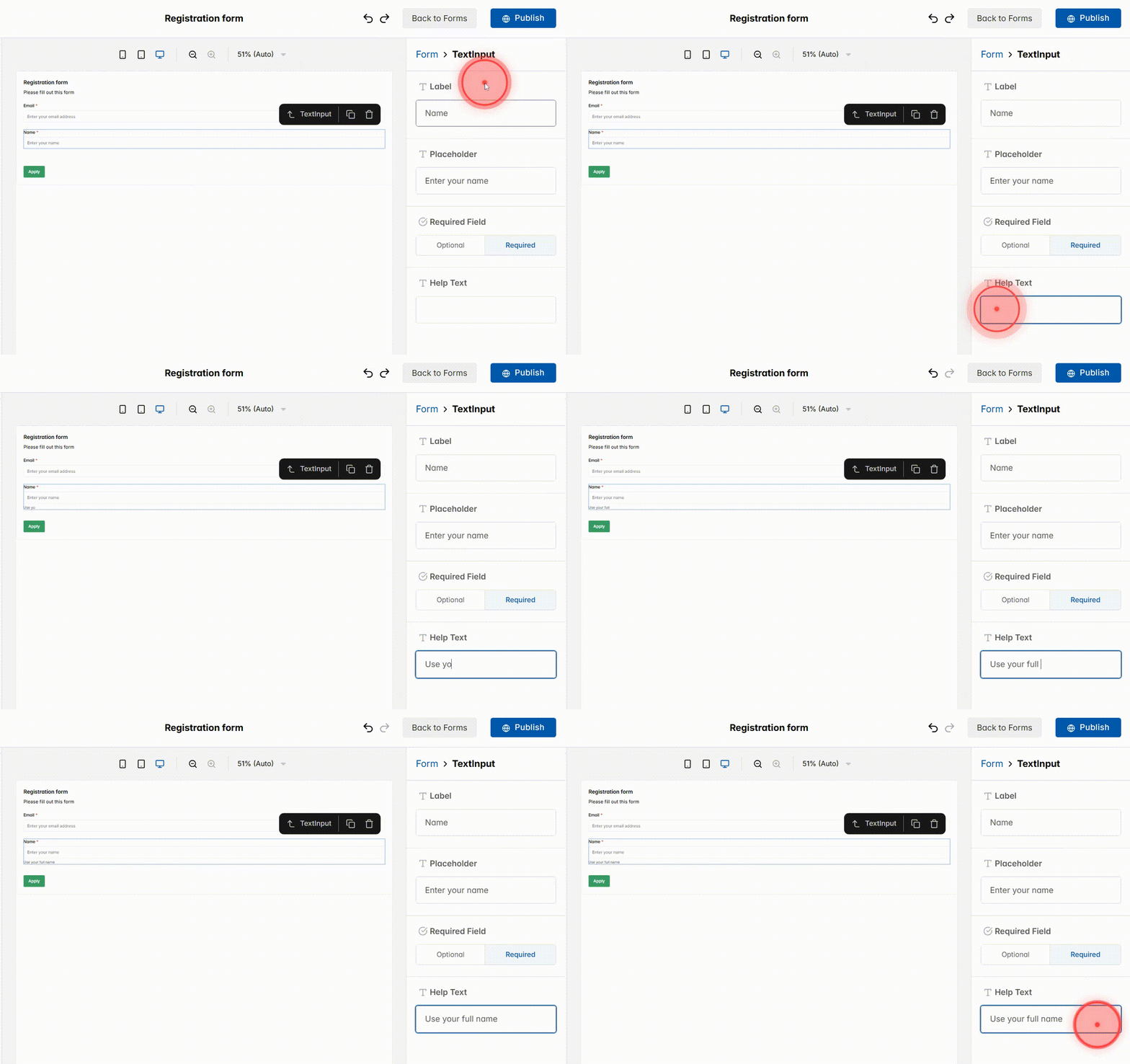
Drag a Text Input field into the form and configure it. This field is for short answers like name or email, and you can set it up so learners clearly understand what to enter.
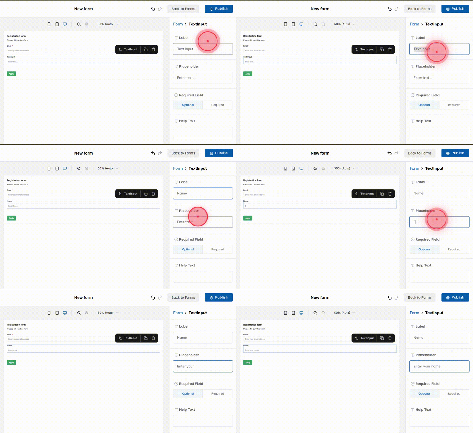
10
Configure the text input field:
– Label → The title shown above the box. (e.g. Name)
– Placeholder → Example text inside the box that disappears when users type. (e.g. Enter your name)
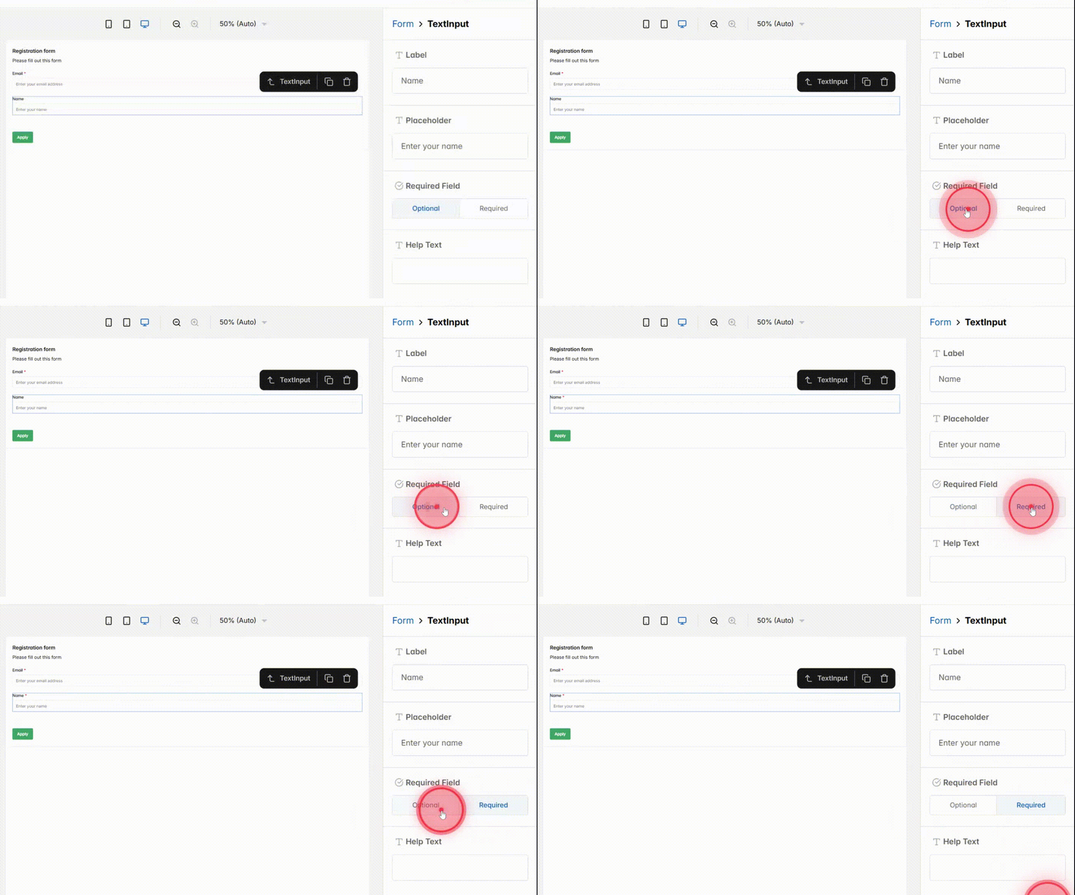
11
Set the Requirement settings:
– If you select Optional, learners can skip this field and still submit the form.
– If you select Required, learners must fill it in before submitting the form.
12
Add a short explanation in the Help Text field under the input to guide users and make the form easier to use.
13
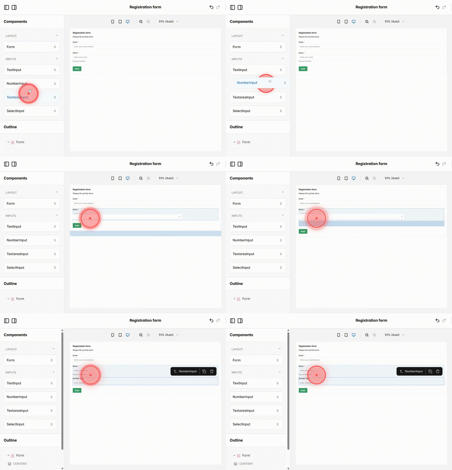
Drag and drop a Number Input field from the components panel into your form. This field is used when you want users to enter numeric values, such as age or number of classes per week.
14
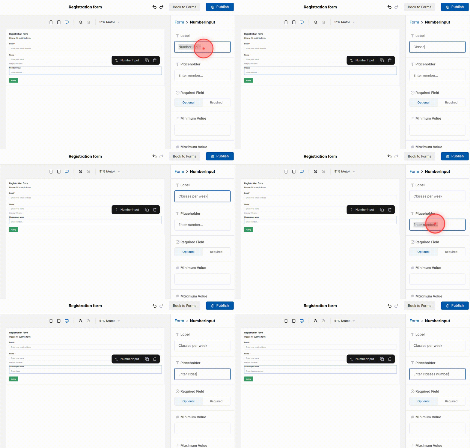
Fill in the field details:
– Label → Title shown above the field (e.g. Classes per week).
– Placeholder → Short guide inside the field before users type (e.g. Enter a number).
15
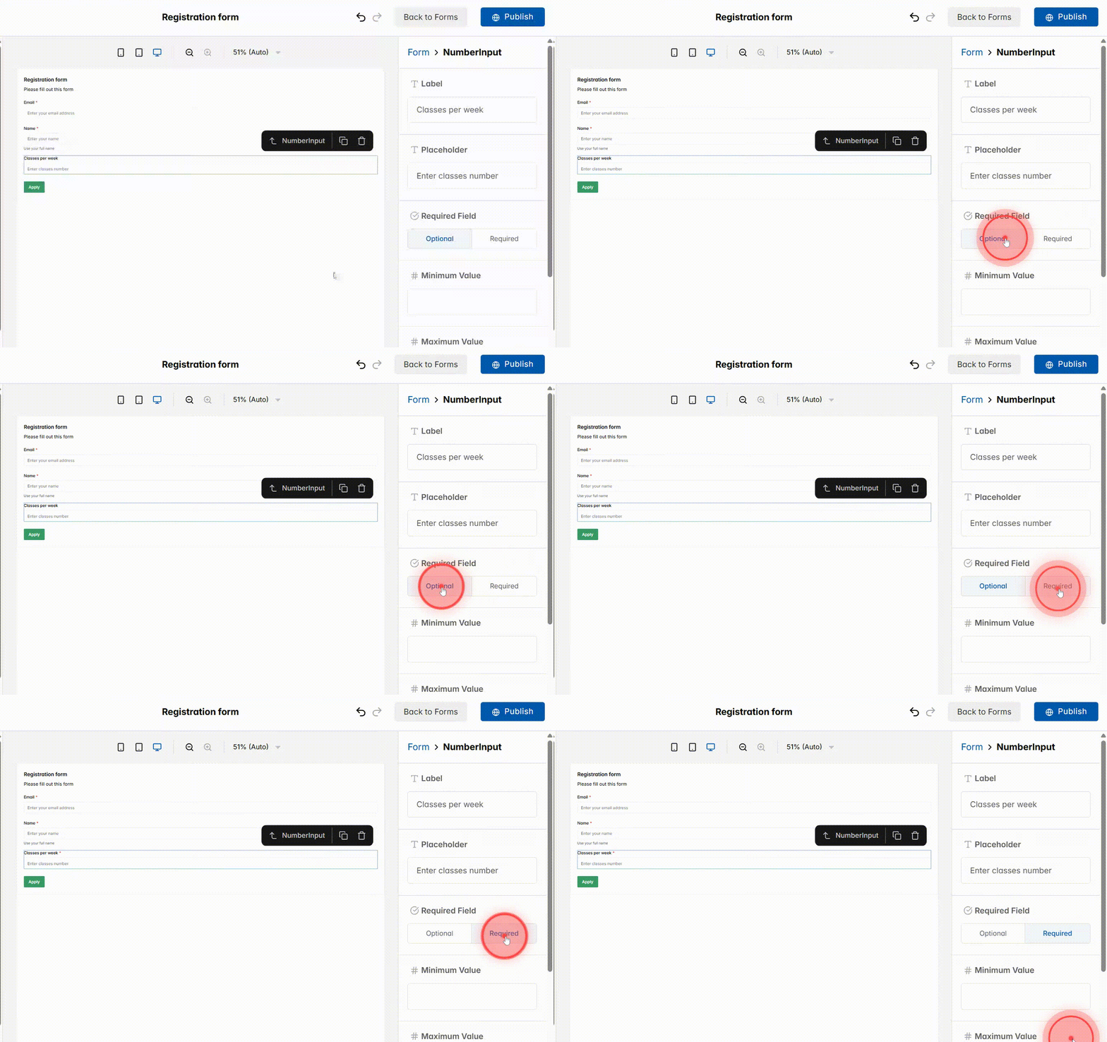
Configure the requirement settings:
– Optional → Users can leave this field blank.
– Required → Users must fill in a number before submitting the form.
16
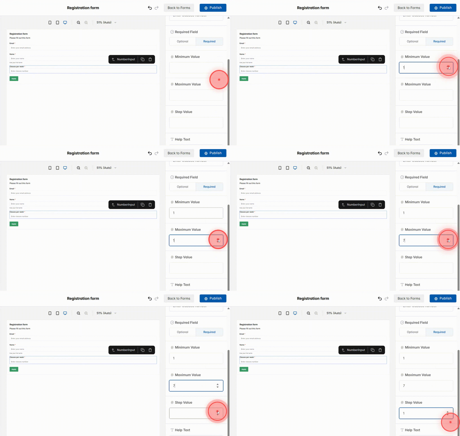
Set input restrictions:
– Minimum Value → Smallest number allowed
– Maximum Value → Largest number allowed
– Step Value → Number interval
For example, with Classes per week, set Min = 1, Max = 7, Step = 1. Adjust based on your field’s purpose.
17
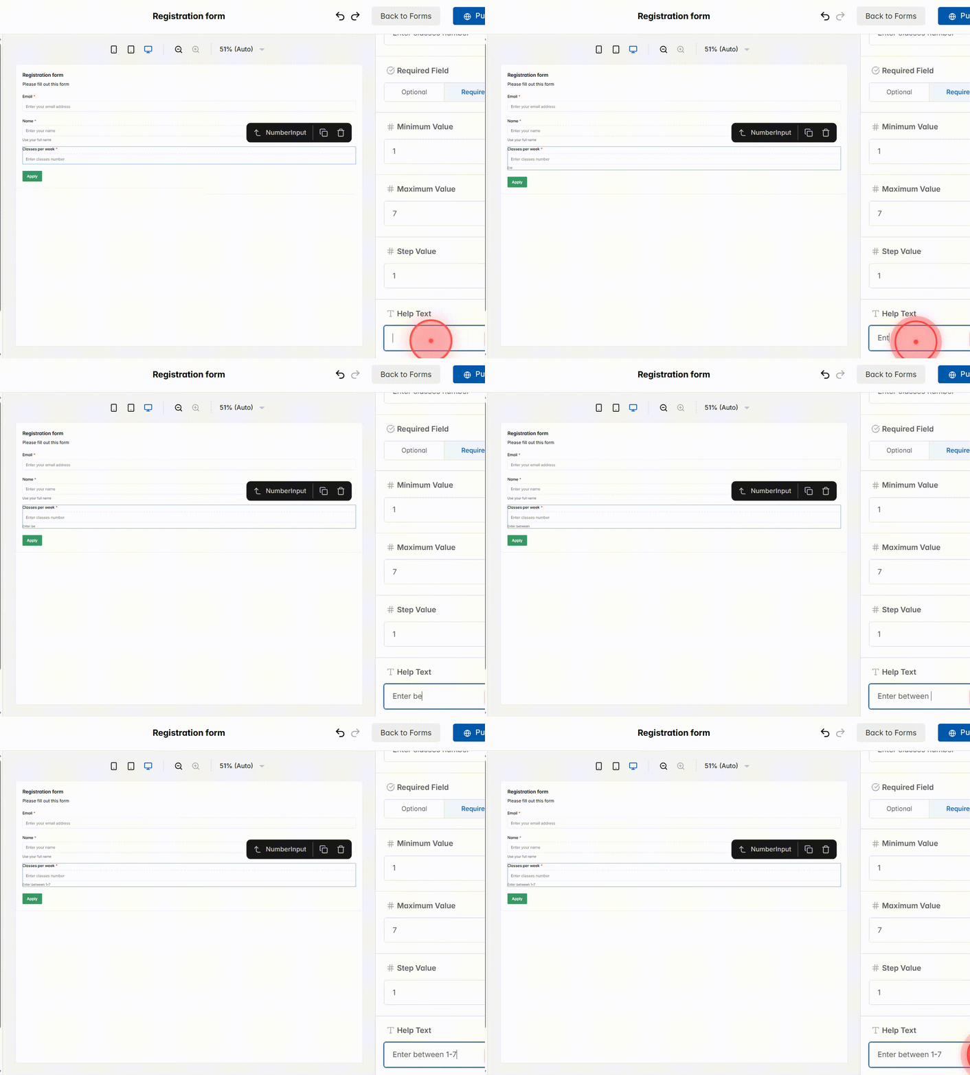
Add a short note in Help Text under the field to explain its purpose and guide users clearly
18
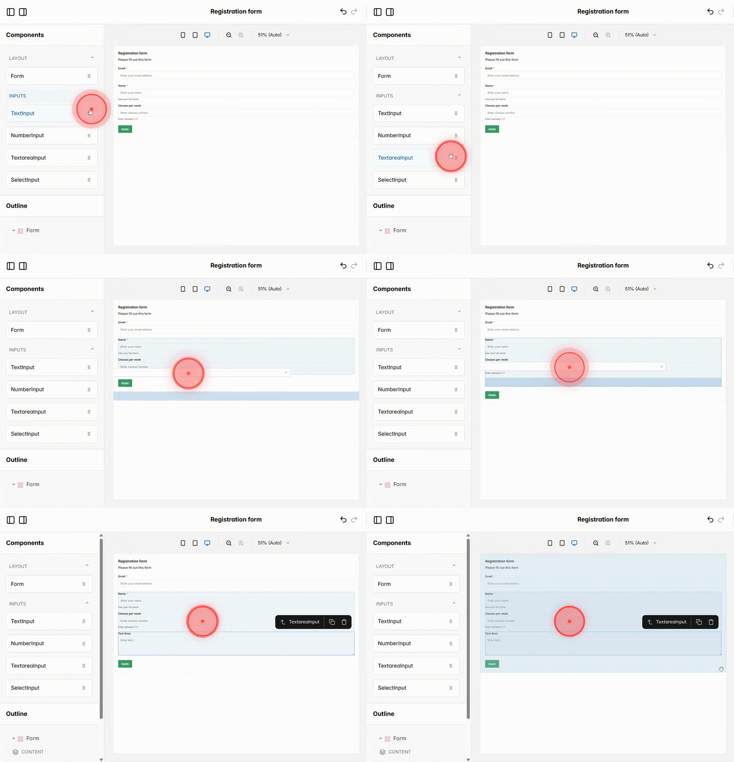
Click and drag a Text Area Input from the components panel into your form. This field is designed for longer responses, such as comments, detailed feedback, or additional information that doesn’t fit into a single-line text box.
19
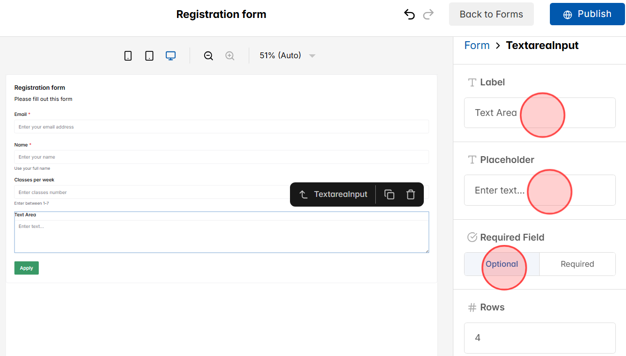
Fill in the Label (title of the field), the Placeholder (sample text to guide users on what to write), and set whether it’s an Optional or Required field, just like with Text Input.
20
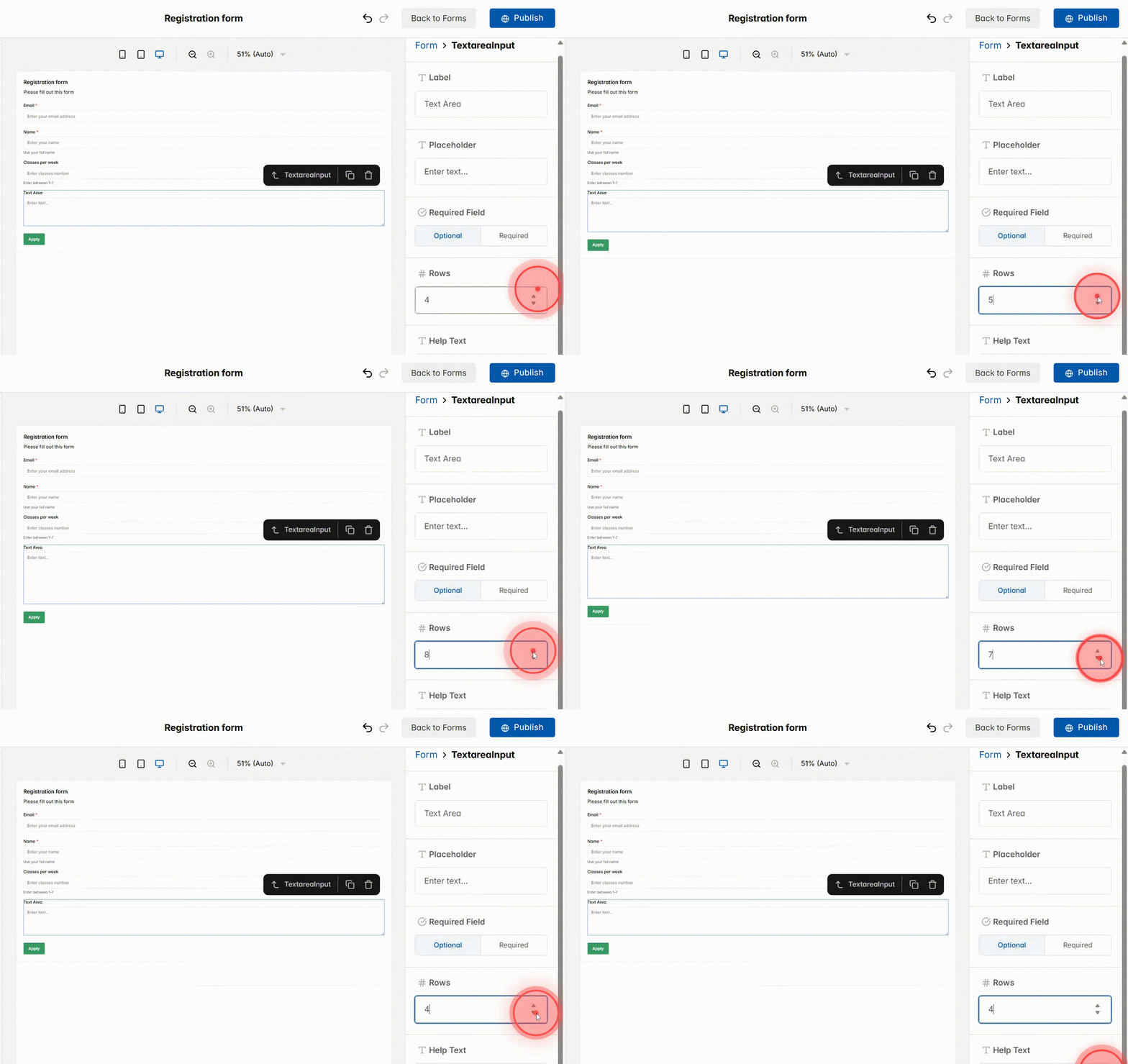
Adjust the Rows value to control how much visible space the text box has, depending on the length of answers you expect.
21
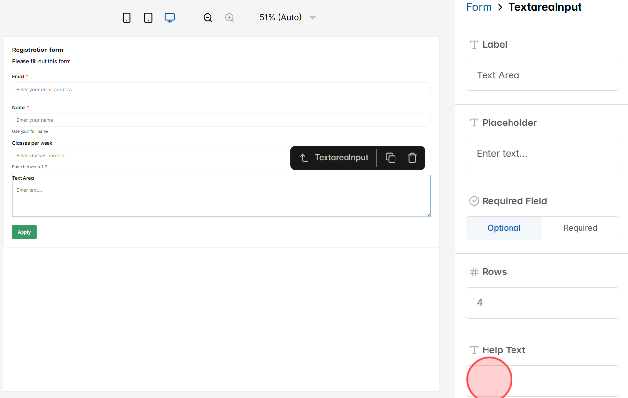
Add supporting text in Help Text if you need to clarify instructions or provide extra guidance for users.
22
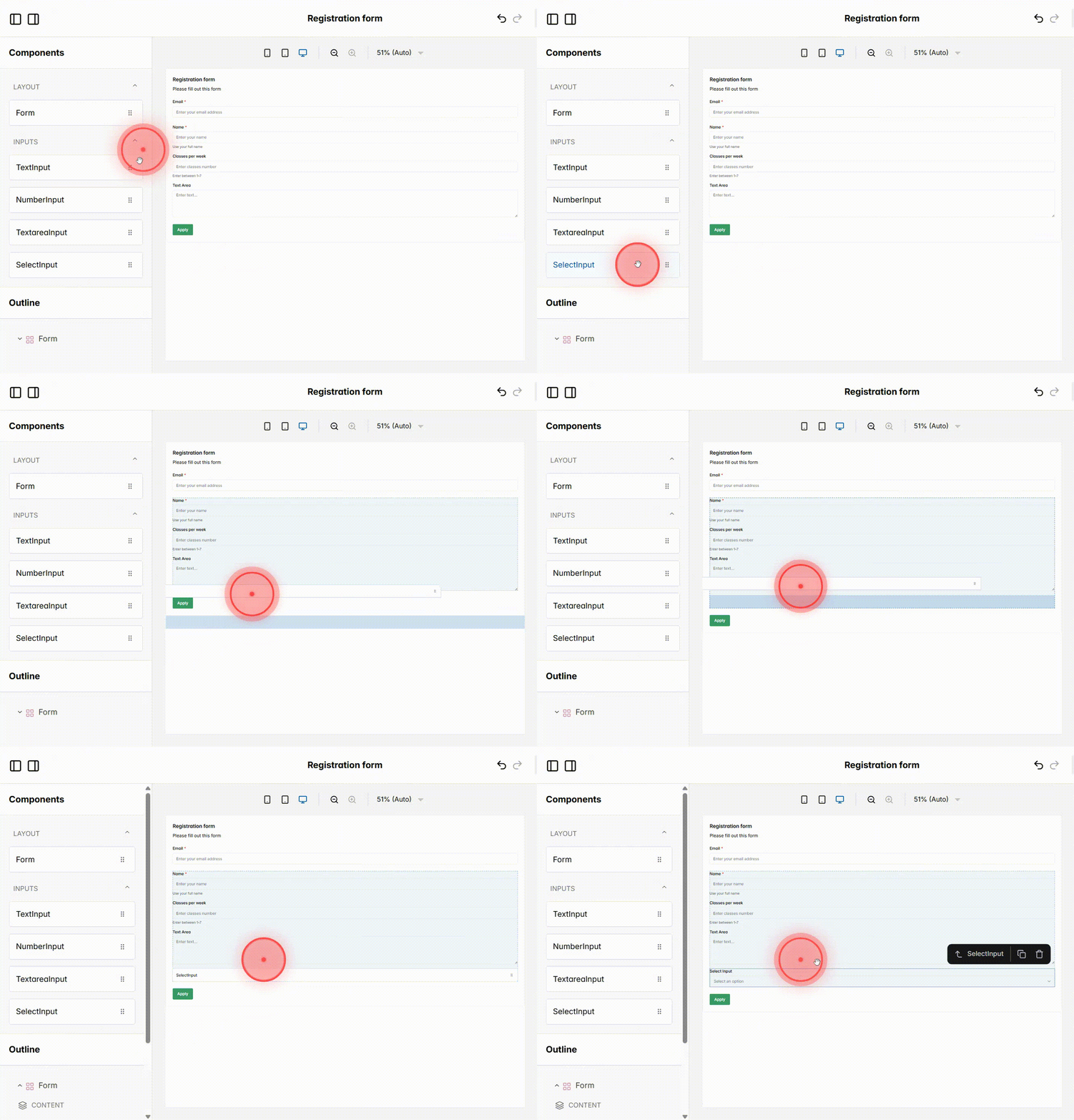
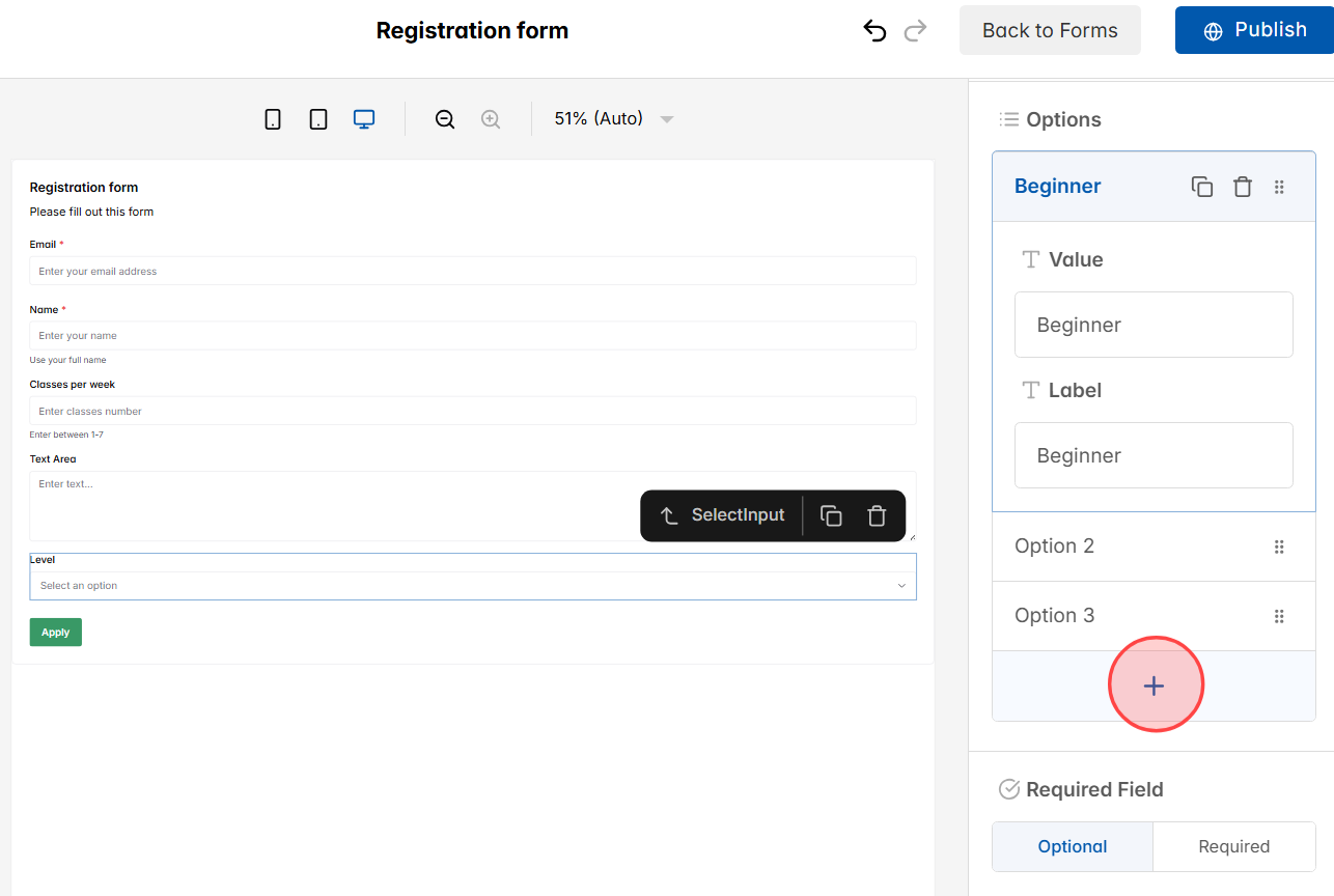
Drag and drop a Select Input from the components panel into your form. This field lets users choose from a dropdown list instead of typing their answer.
23
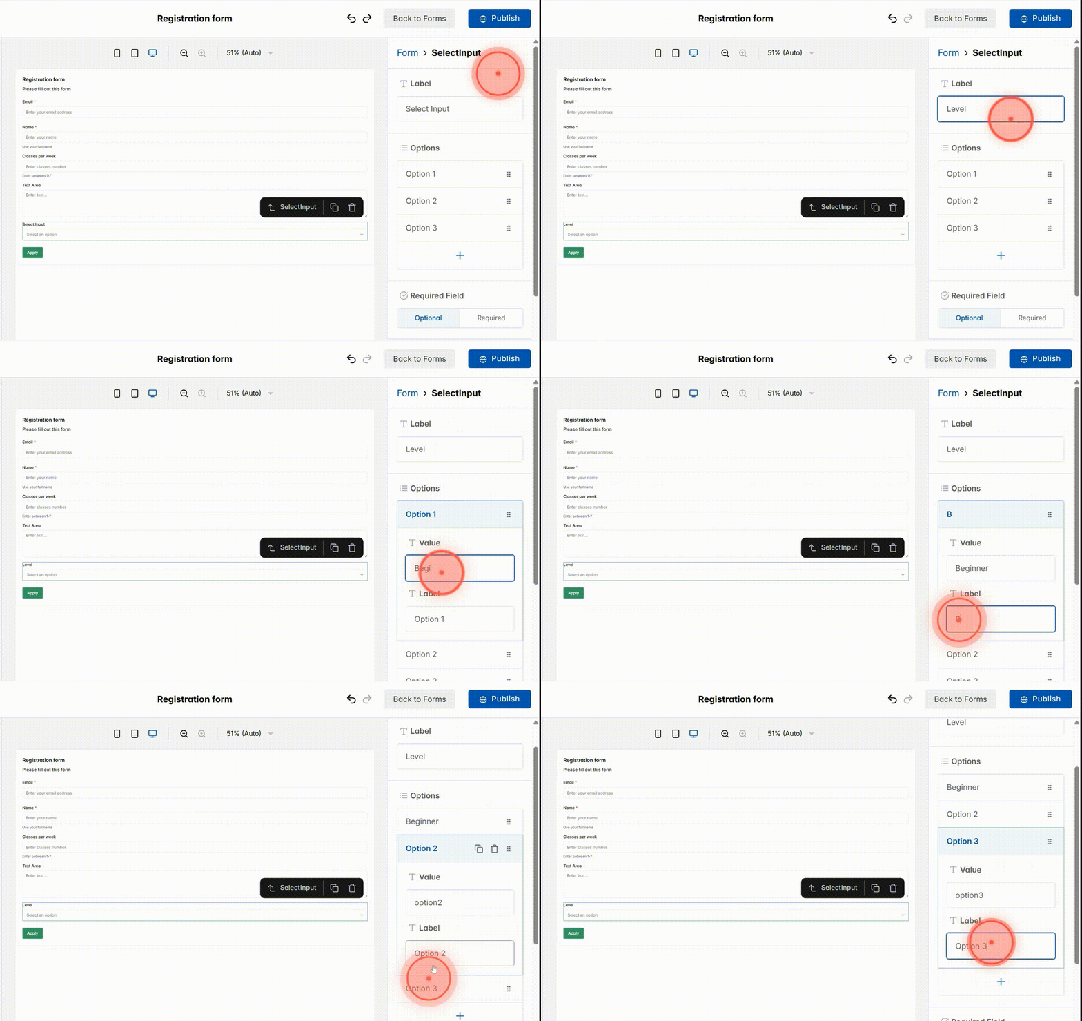
– Enter a Label so users understand what the dropdown is asking (e.g. Select Course Level).
– Click each option row to add option details:
+ Enter a Value → this is the system data saved (e.g. beginner, intermediate, advanced).
+ Enter a Label → this is the text users see in the dropdown (e.g. Beginner, Intermediate, Advanced).
24
Click the + button if you want to add more options to the dropdown list.
25
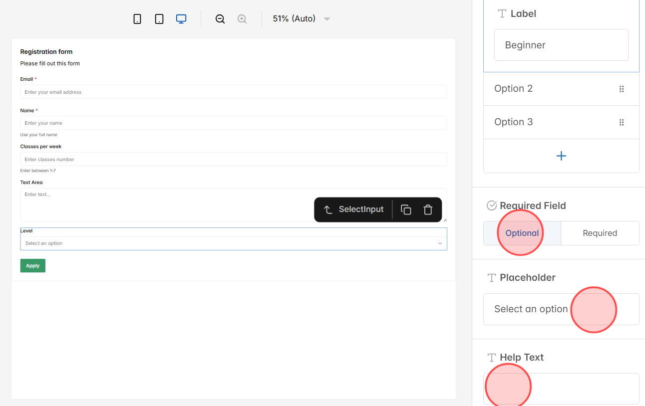
Set whether the field is Required (must be chosen before submitting) or Optional (users can skip it). You can also add a Placeholder to show default guidance text inside the dropdown, and use Help Text to give more instructions if needed.
26
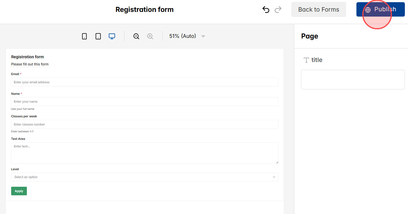
When all fields are set up, click Publish to save your form and make it active.
27
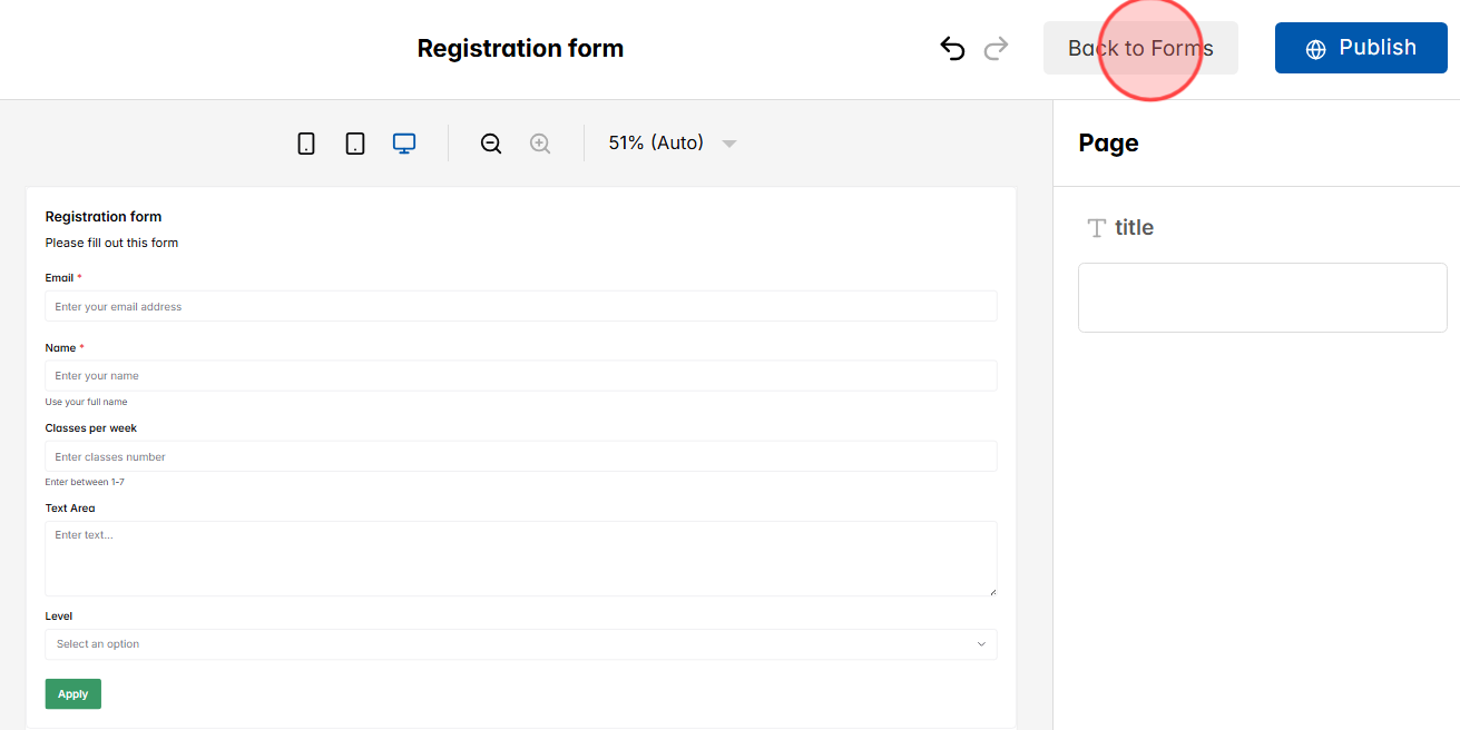
Click Back to Form to return to the full list of forms in your dashboard.
28
The page will display all created forms so you can review or manage them.
– Click the Edit icon to update an existing form.
– Click the Delete icon to remove a form you no longer need.
