1
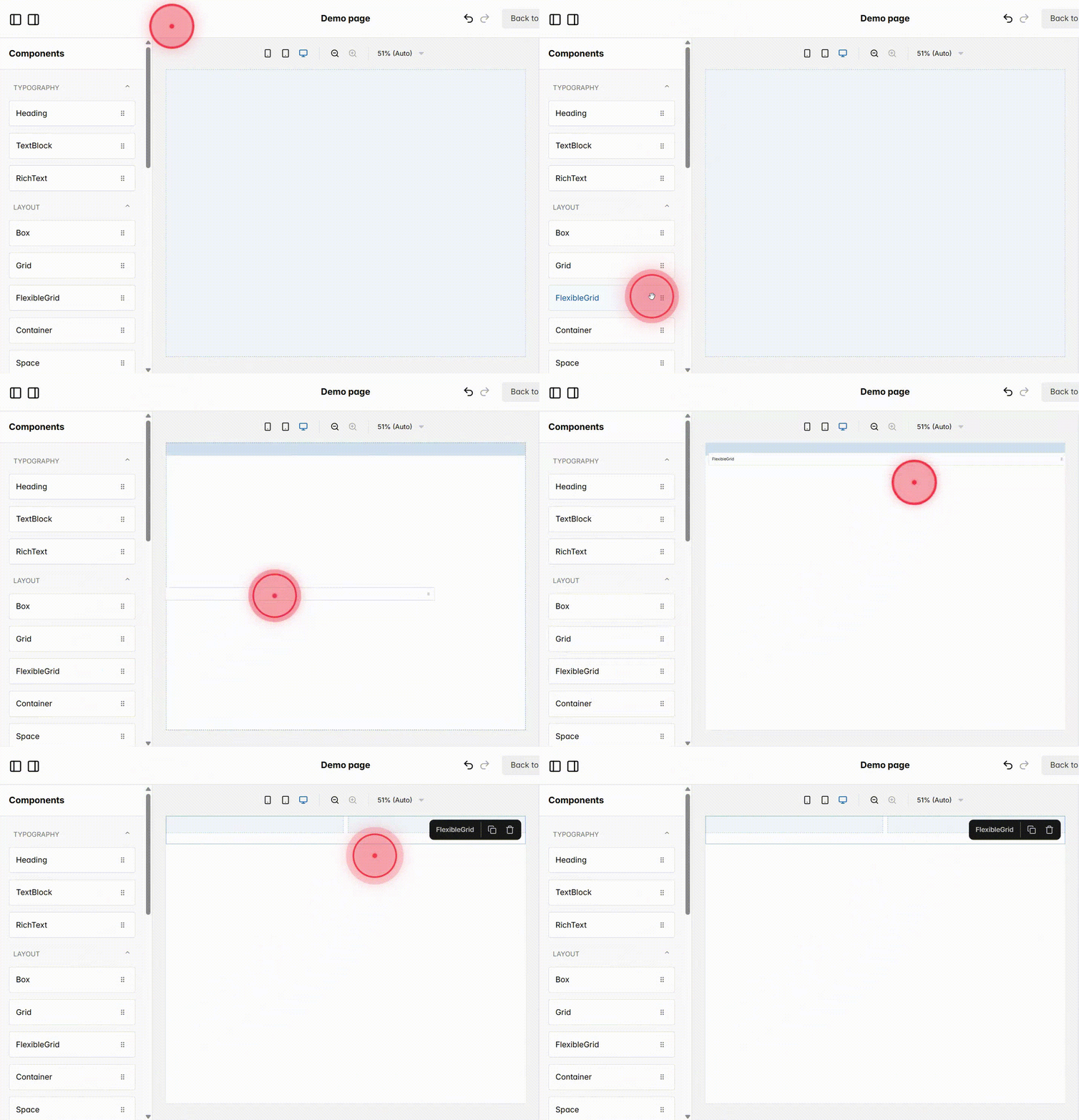
Click and drag Flexible Grid from the Elements panel into your page. A Flexible Grid is different from a normal Grid because it allows you to define separate layouts for Desktop, Tablet, and Mobile, and it automatically adjusts your design across different screen sizes.
2
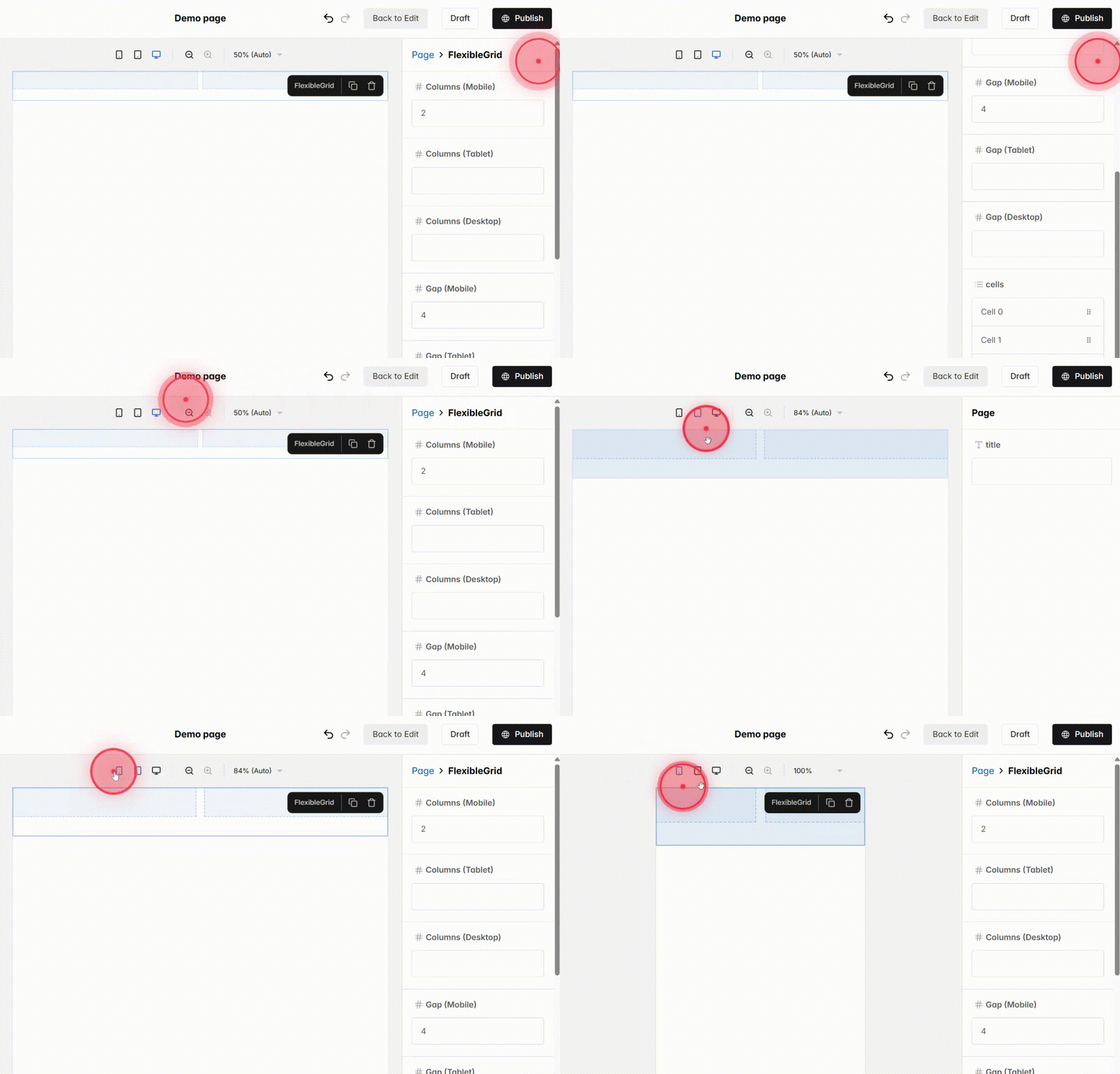
You can adjust the number of Columns and Gap for each view: Desktop, Tablet, and Mobile. This gives you control over how the layout will look on each device and ensures that your design is responsive and balanced.
3
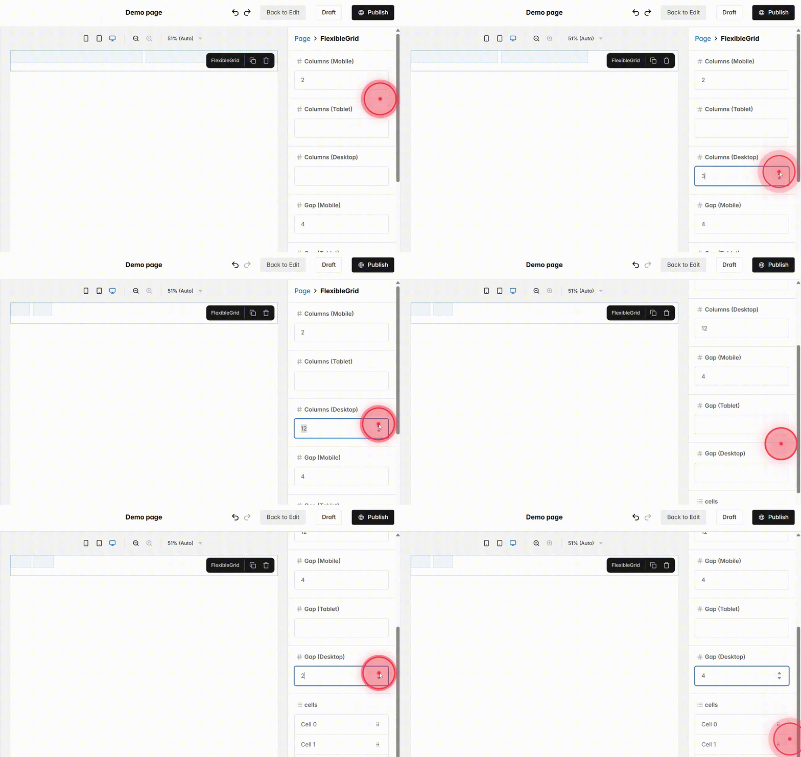
Start with Desktop and set Columns (Desktop) and Gap (Desktop):
– Columns (Desktop) – total columns on desktop layout (max 12). Choose a number that allows cells to fit evenly; for example, 12 columns allow flexible multiple cells, e.g., three equal cells (4+4+4), two cells (6+6), or highlight a larger item (8+4), keeping layout balanced.
– Gap (Desktop) – spacing between cells; higher gap increases spacing, lower gap tightens the layout.
4
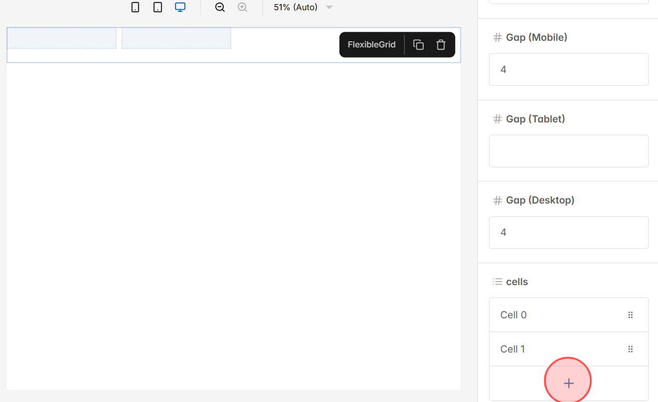
After setting Columns (Desktop) and Gap (Desktop), go to edit Cell. Click the + button to add cells. Each cell can hold text, images, or buttons while following the grid structure.
5
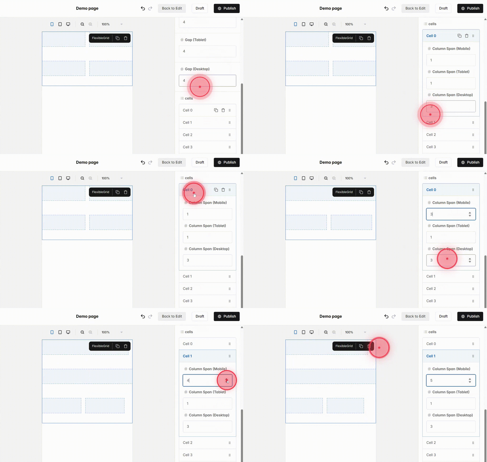
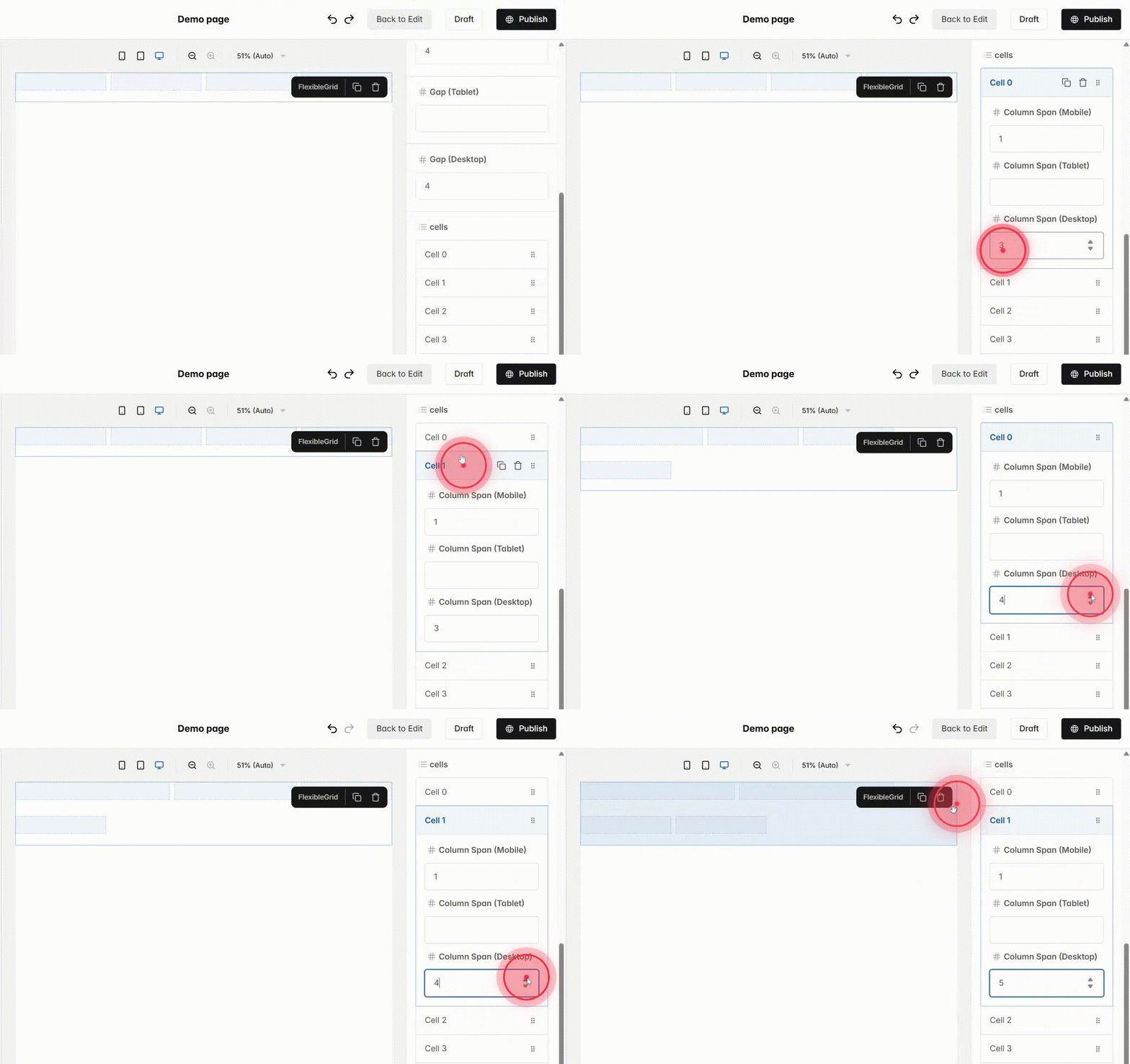
Fill in Column Span (Desktop) for each cell to control its width. With Columns (Desktop) set to 12, dividing evenly gives 4 cells at span 3. If you set a span larger than 3, extra cells will wrap to the next row, breaking the layout balance.
6
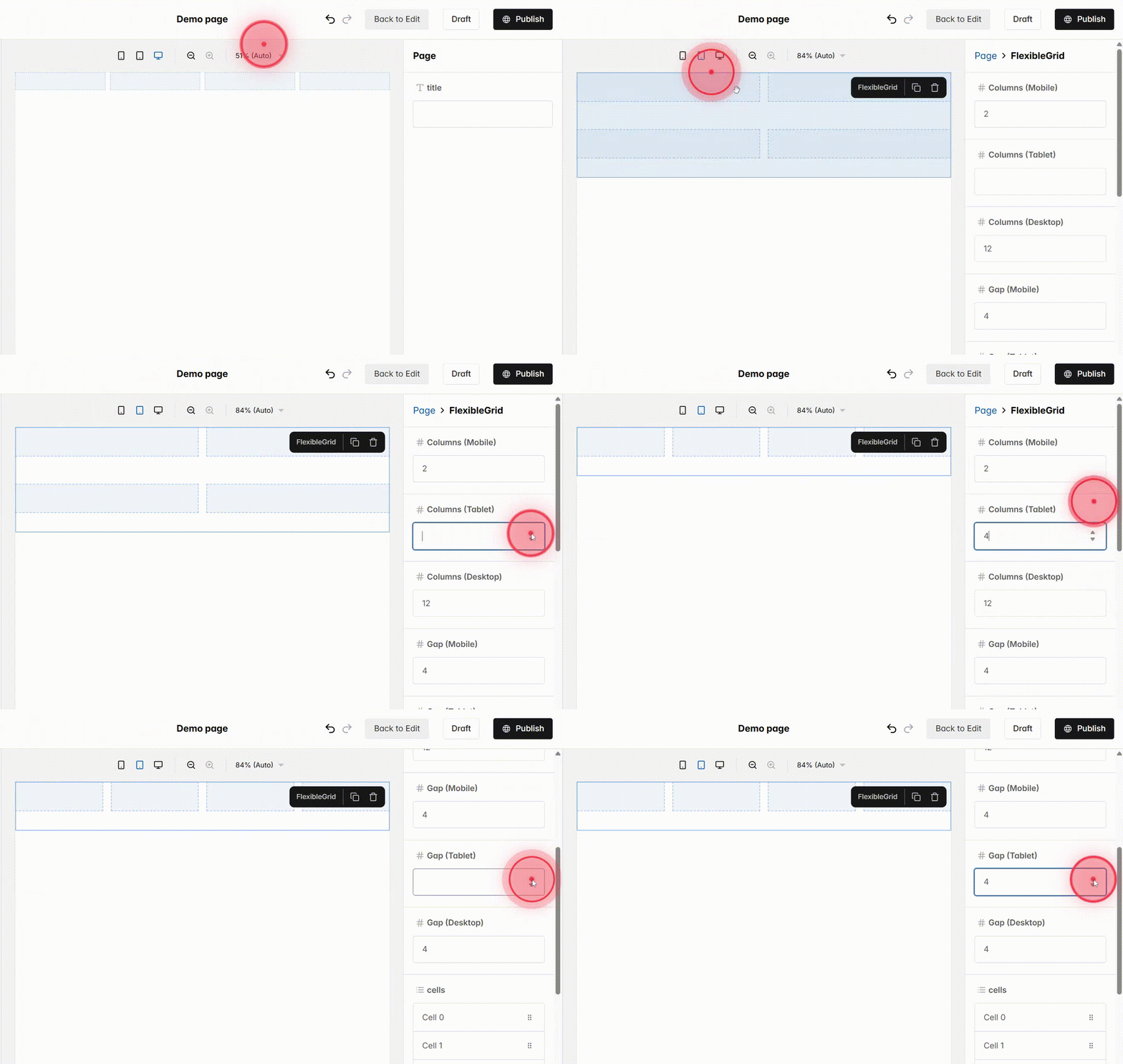
Switch to Tablet view to adjust layout for smaller screens and set:
– Columns (Tablet) – max 12, but 4 is recommended to keep cells readable and proportionate, with highlights spanning 2–3 columns and smaller items 1 column. You can also use 3 or 6 columns for different layouts.
– Gap (Tablet) – spacing between cells, adjusted to maintain balance with fewer columns.
7
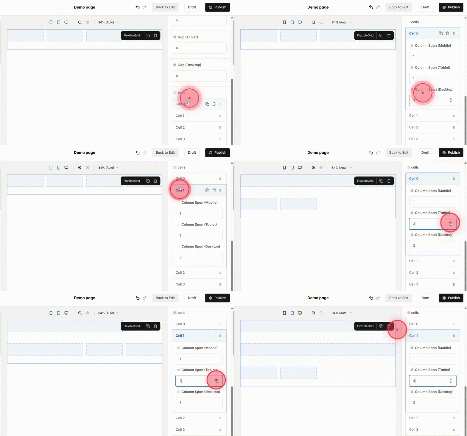
Then, fill in Column Span (Tablet) for each cell, making sure to assign spans in the current view for an accurate preview. With Columns (Tablet) = 4, the most balanced setup is 4 cells with span 1 each. If you set a span larger than 1, extra cells will wrap to the next row and make the layout look uneven.
8
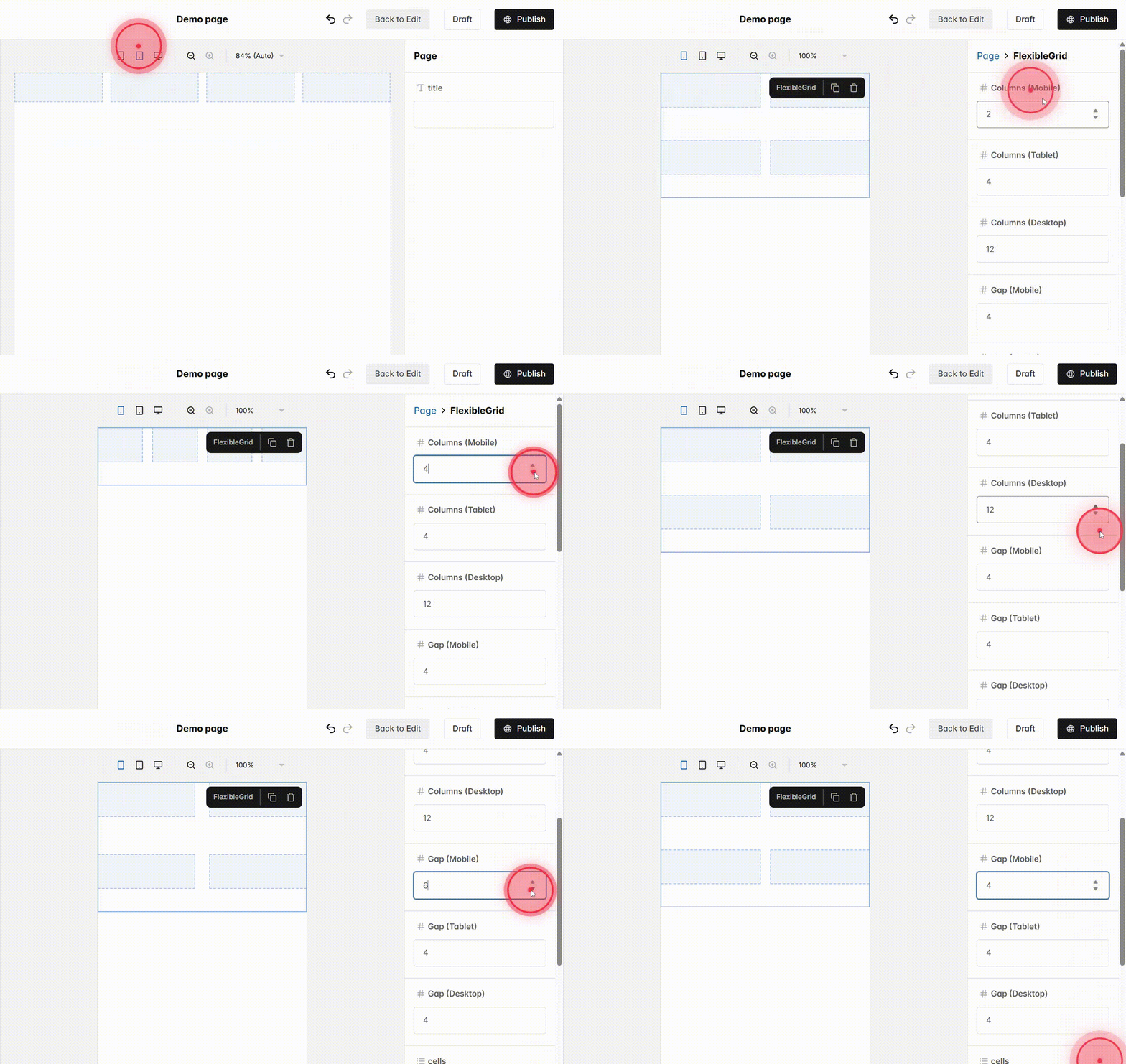
Switch to Mobile view and adjust:
– Columns (Mobile) = 2 – recommended because narrow screens work best with simple layouts; highlights span both columns (full width), smaller items use 1 column, keeping everything clear and easy to use.
– Gap (Mobile) – spacing between cells, adjusted to maintain balance with fewer columns.
*Mobile is pre-set for optimal display, but you can adjust both if needed.
9
Finally, fill in Column Span (Mobile) for each cell. Defaults are pre-set for balance, but you can adjust as needed. With Columns (Mobile) = 2, use span 1 for two equal cells or span 2 to highlight a full-width item, keeping the layout responsive.
